Master Bathroom Makeover [Southlake Texas Interior Designer]
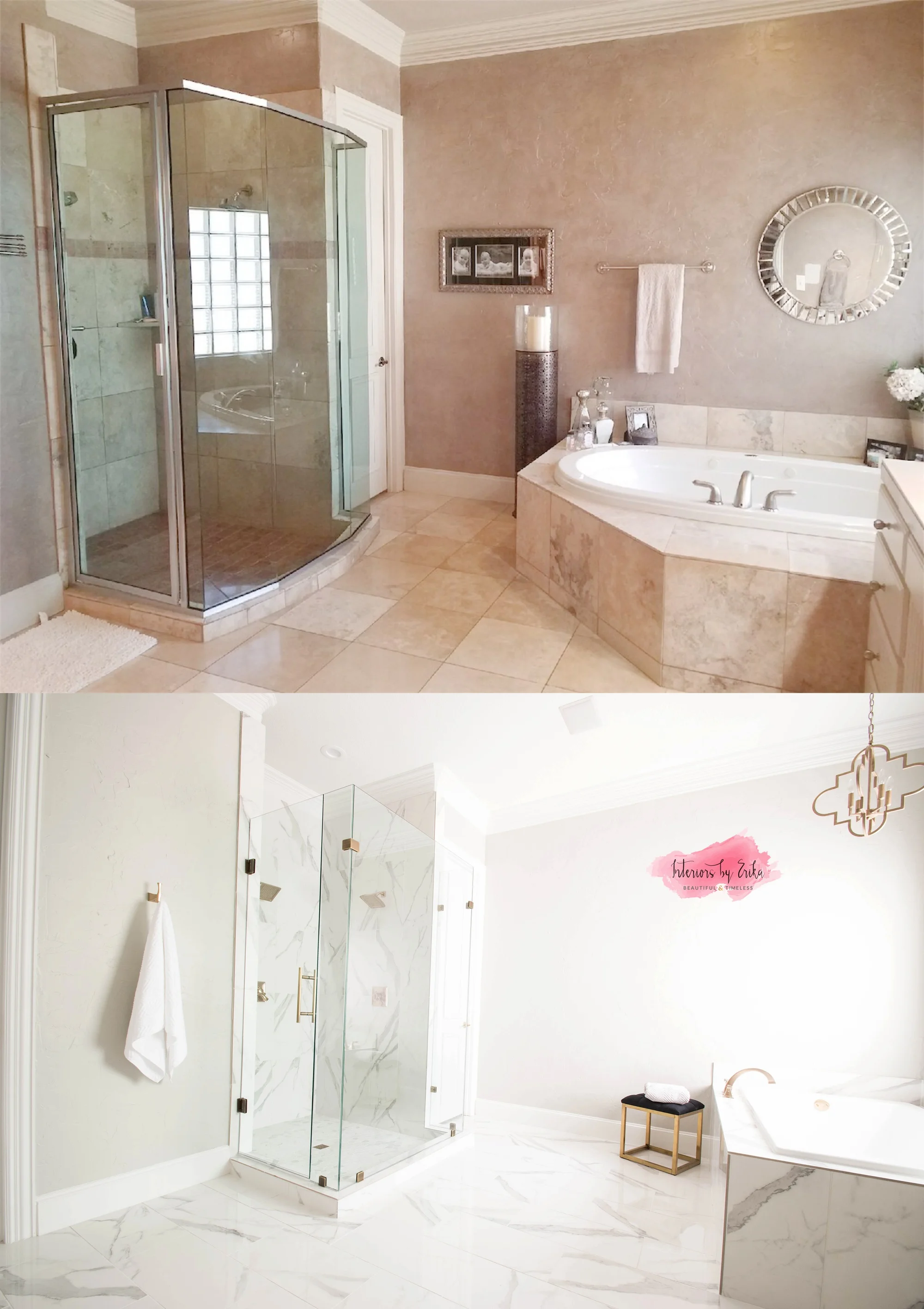
This recent bathroom remodel has been one of my favorite bathrooms to work on. I had a wonderful client, with amazing taste, which made it super easy to collaborate and come up with a stunning end product. She was tired of her outdated, dark bathroom and wanted a spa like Master bath.
With only one small window it was important to use colors that would brighten up the space. We chose Repose Grey by Sherwin Williams for the walls. Both vanities had a fur down ceiling that not only did it block the light, it actually made the space look smaller and more cramped. We removed them for a cleaner more updated look. We replaced the mirrors and added wall sconces. I was able to keep the existing cabinetry, which helped stretch the budget, we changed the countertops for beautiful and durable New Carrera Quartz and added aged brass faucets and cabinet hardware.
We reconfigured the tub layout, which opened the room up considerably. By turning it and placing it under the window, we almost doubled the space between the tub and shower, which is also the walking path to get to the closet. We put a sleek and comfy ottoman next to it, for a decorative element that also functions as a place to set your towel when you are getting in and out of the tub.
We were also able to expand the shower by taking away the weird angles, and making it totally frameless. The white and gray tiles on shower walls are show stopping, like a piece of art on display that you can see from all angles of the room. We added double rain shower heads, a niche and a bench.
I also raised the counter top on the main vanity to be all one height, creating a more congruent setting that’s more appeasing to the eye. Other finishing touches included changing all the door hardware to aged brass, and installing a hanging pendant above the tub.
Click through to the gallery below to view all of the "after" images from this stunning bathroom retreat.


